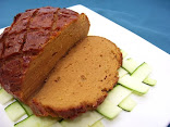
Using a lightbox to photograph your food is great when the sun's not cooperating. It's inexpensive, fun, helpful, and could improve the look of your pics. My one pet peeve about taking pictures of my food, is getting it ready to photograph before the sun goes down! Natural lighting is generally thought to be the best for photography, but I do a lot of my cooking in the evenings, and I'm not a morning person (big surprise!). Also, it's getting harder as the days get shorter and the cloudy Fall and Winter days lie ahead.
Whether you have a DSLR or a simple point-and-shoot, taking pictures with artificial light can be daunting, to say the least. Too much direct light, and you get an awful irradiated, shadowy look. Not enough light, and you get dull looking food- either way, not so appetizing!
 |
"Bad Apples:" Not enough lighting (left), and harsh direct flash (right)
|
The next challenge for
Project Food Blog involves photography. Unfortunately, I didn't make it through, but I was psyched to learn more about photographing food and how to improve my pics, so I decided to go ahead and build my own lightbox. By the way, this competition was amazing- I learned a lot, met a lot of talented bloggers, gained a good number of followers, and nearly tripled my page views! I highly recommend any blogger to enter if they hold this next year, even if you don't think you can do all the challenges- what a great experience!
 |
| U-connector, T-connector, both used together to form a corner |
Here's what you'll need to make this lightbox. Note: others have made them out of a
cardboard box and tissue or tracing paper, and I read of someone using an
Ikea laundry stand that was purchased for $7. I happened to have most of the materials laying around the house already- no, we're not hoarders, but we do have an awful lot of crap.
Sizes may vary, but mine was about 25" wide, 25" deep, and 37" tall.
-pvc pipe (10 pieces, cut to desired size) -you could probably get someone at the hardware store to cut them.
-pvc corner fittings (8 "T" connectors and 4 "U" connectors)
-one roll of white poster paper (I used a 24" wide roll from OfficeMax for @10 bucks)
-one twin flat white sheet, or similar (I used a non-shiny white painter's tarp), cut into appropriate sizes to cover the sides, top, and front (optional)
-white foam core piece for bottom (optional).
-one roll of sticky velcro, cut into multiple pieces to hold the sheet
-simple shop lamps with clamps (at least 3), plus any household lamps you can use.
-light bulbs for lamps (I used 60 watt 5000k daylight fluorescent bulbs with an output of 800 lumens). I had 8 bulbs going, and I could probably add a few more.
Assembly This is how it looks put together. I didn't bother gluing anything, so it can be easily disassembled. Make sure you measure carefully before you cut. The pieces that I added under the front poles are there because I made mine a little too big for my table- make sure to get the size right for the space your going to put it on! I ended up leaving it this way because the size would be perfect for a standard rectanglular table, if I decided to move it to another location.
 |
Sides measured, cut, then applied to the frame with sticky velcro; roll of paper strung over rear top bar
|
I cut the sticky velcro into small squares, and used them to attach the "walls" to the frame. The roll of poster paper was strung over the rear top bar and brought to the front to create a seamless white background.
Placement of LightingYou'll want to play with the placement of the lights you have. Make sure to light from both sides if possible, one on top, and one pointing towards the back wall. Note: all lights should be adjustable, as you'll have to play around with the angles to get the lighting you want.
Options to Improve Lighting |
Roughly constructed bounce card made of foam core
|
Make your own "bounce card" or "fill card" to reflect more light onto your object. All you need is some white foam core, poster board, or cardboard covered with white paper.
 |
| A subtle difference, but the bounce card brightened the front of the apple and reduced shadows. |
Mimic Natural Sunlight |
A hole cut into a side wall will allow some direct light, giving a sunlight effect.
|
Cut a small slit into a side wall, and shine a light through the hole and onto the object, so the light goes through the fabric, but also gets partially diffused too. Make adjustments and use fill cards as necessary.
 |
| Artificial Sunlight Effect (raw) |
 |
| Same picture after contrast was adjusted in a photo processing program (I used Gimp), although I think the collard greens look a little too dark! Could use more adjustment. |
 |
| Taken earlier with natural light (raw) |
Other Helpful TipsComposition is important too. Think about things like:
-Does the food look balanced on the plate (i.e. colors, textures, foreground/background, etc.)
-Do accessories distract or add to the picture? Background as well.
-Does the food look like it should (i.e. sauces should look shiny, mashed potatoes should look fluffy, overall should look fresh, etc.)
Use a tripod if you can, to reduce shaking.
Also, learn how to process pics to adjust size, dpi, color, brightness, contrast, etc., by using a program such as Photoshop. I use Gimp, which is a simpler version (example above).
I'm still pretty new to this, and I'm sure some of you are pros- have any tips to add? Let us all know in comments, and thanks for sharing!


